Sacred Celebrations was never about standing at the front of a room. It was about what happens in the space between people. The pauses. The emotion. The meaning that lives beneath the words. This project began by slowing down and listening, allowing the brand to be shaped by intention rather than expectation.
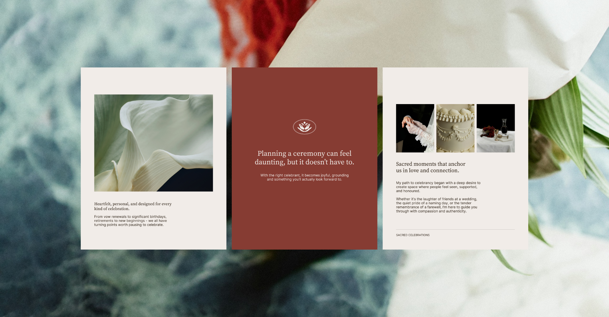
Sacred Celebrations began with listening. Through a considered discovery process, we uncovered a brand rooted in ritual, human connection, and the quiet power of ceremony. This wasn’t about tradition or performance, but about creating space for meaning, emotion, and presence.
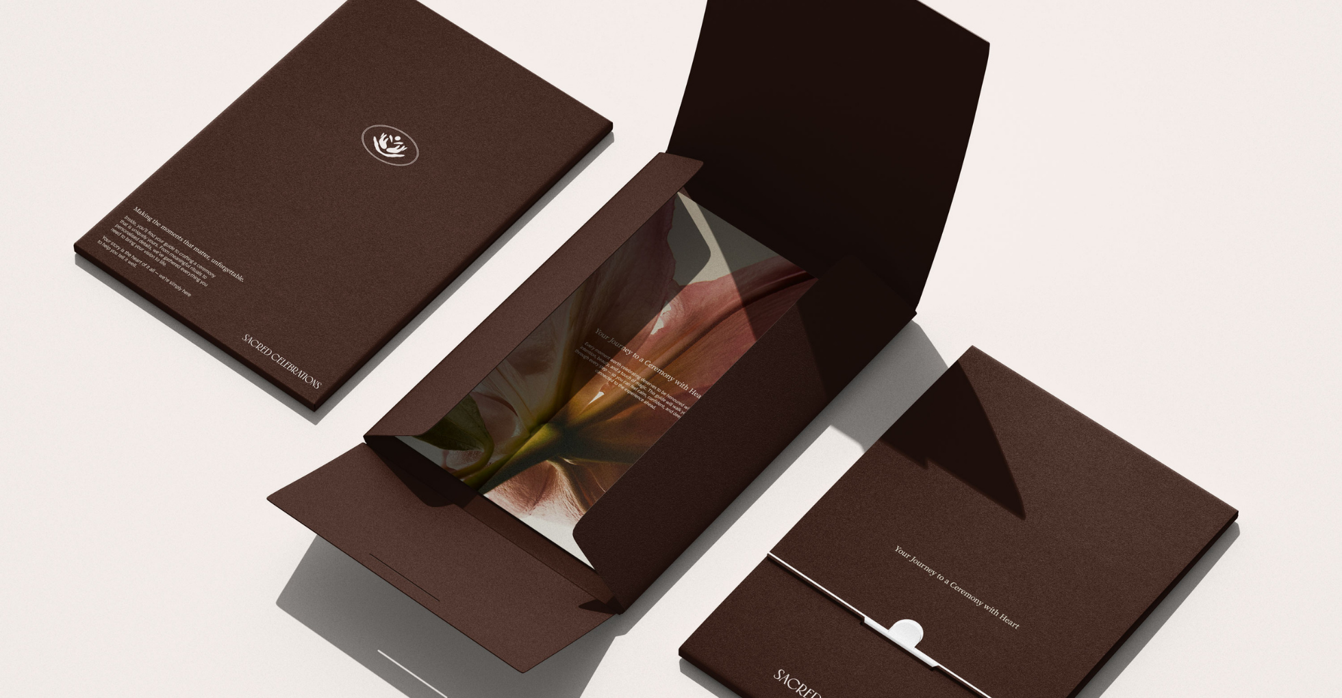
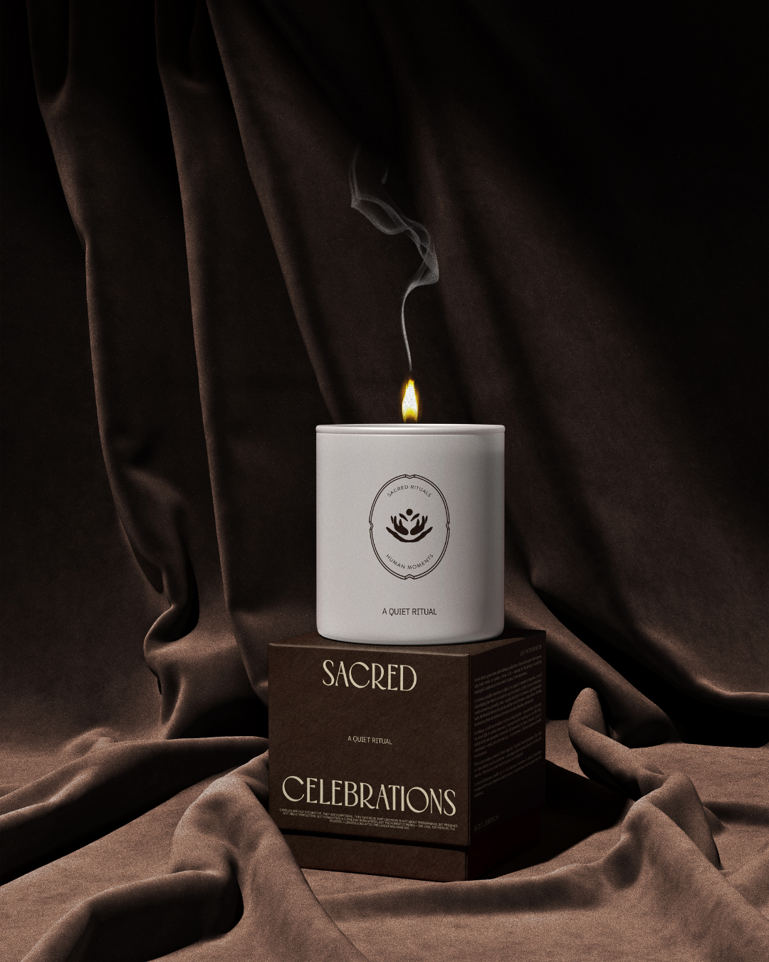
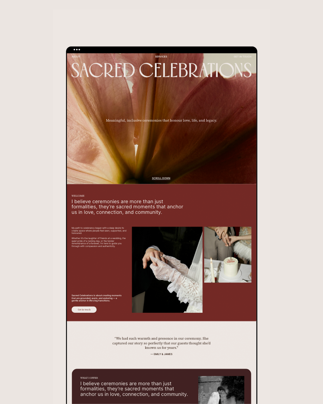
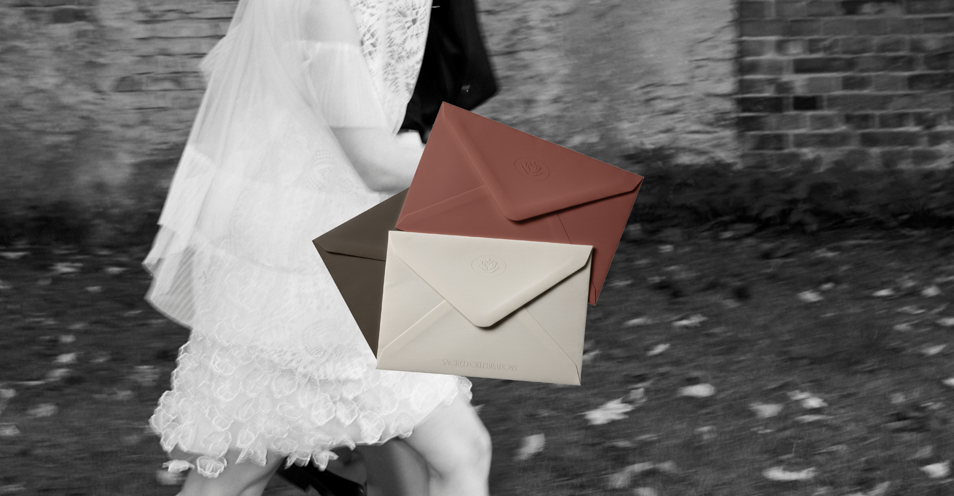
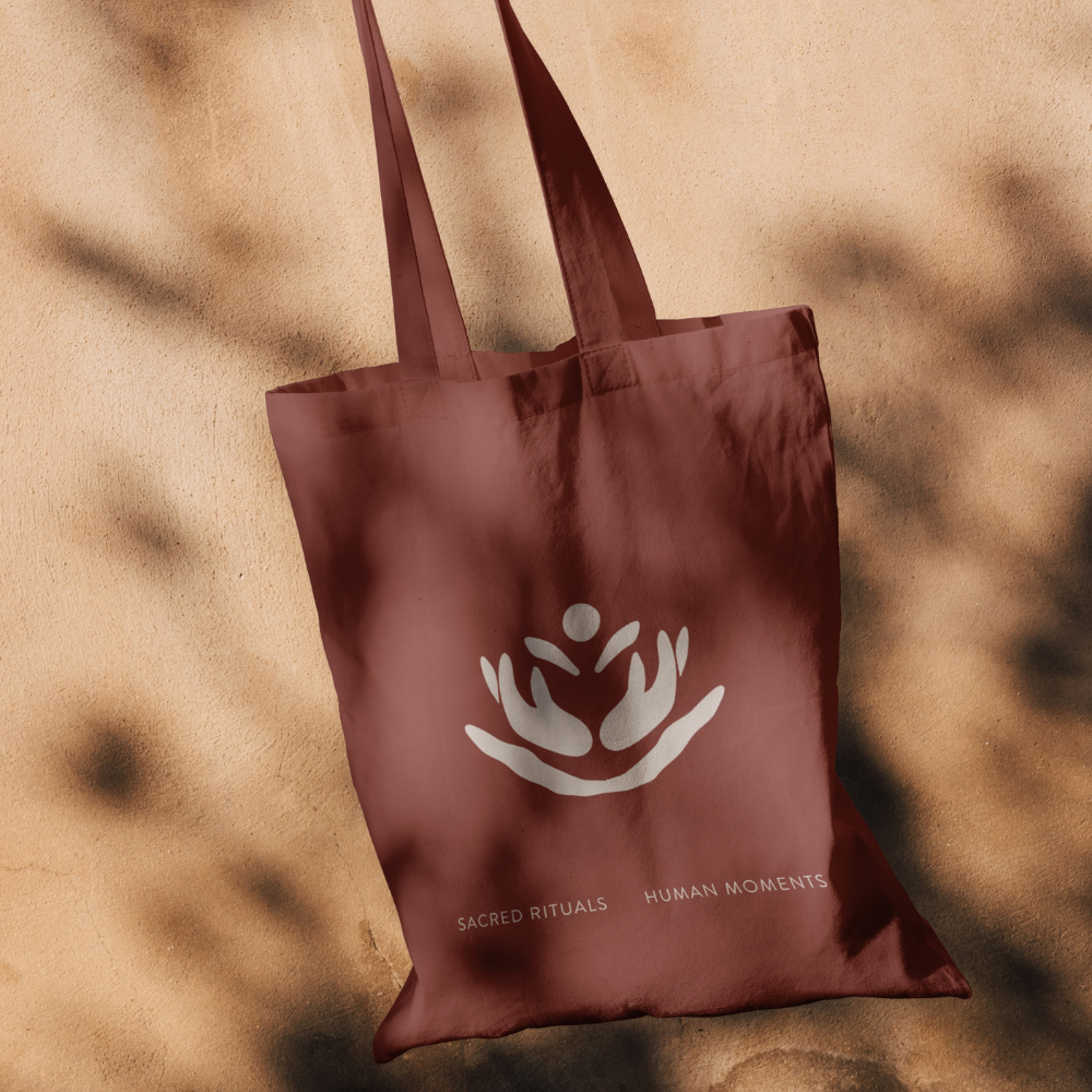
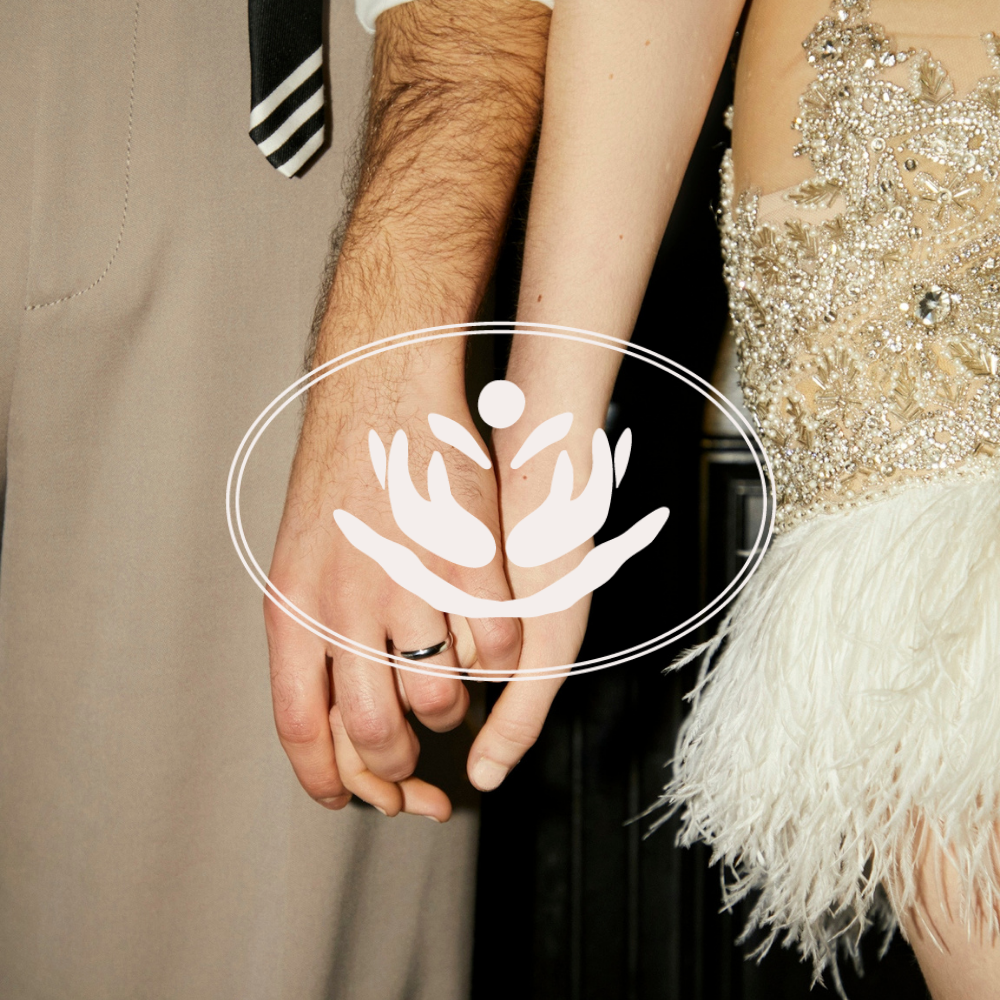
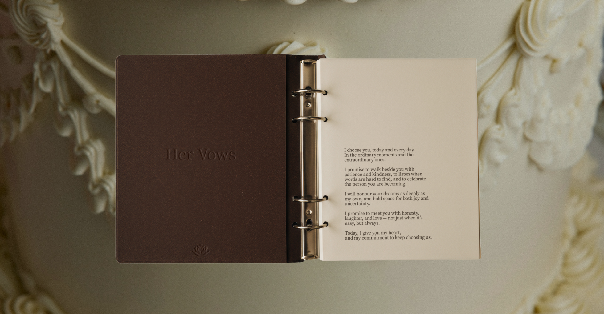
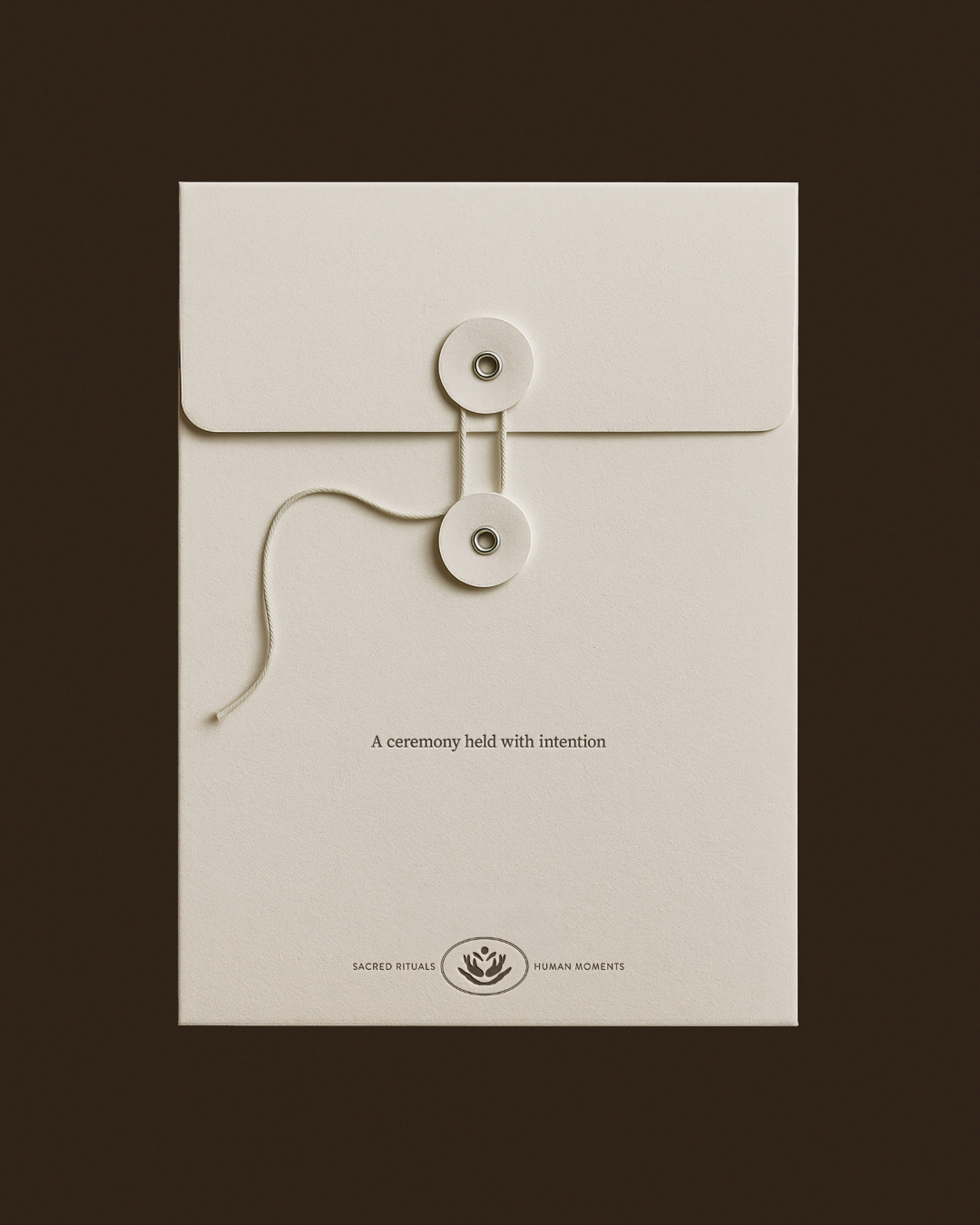
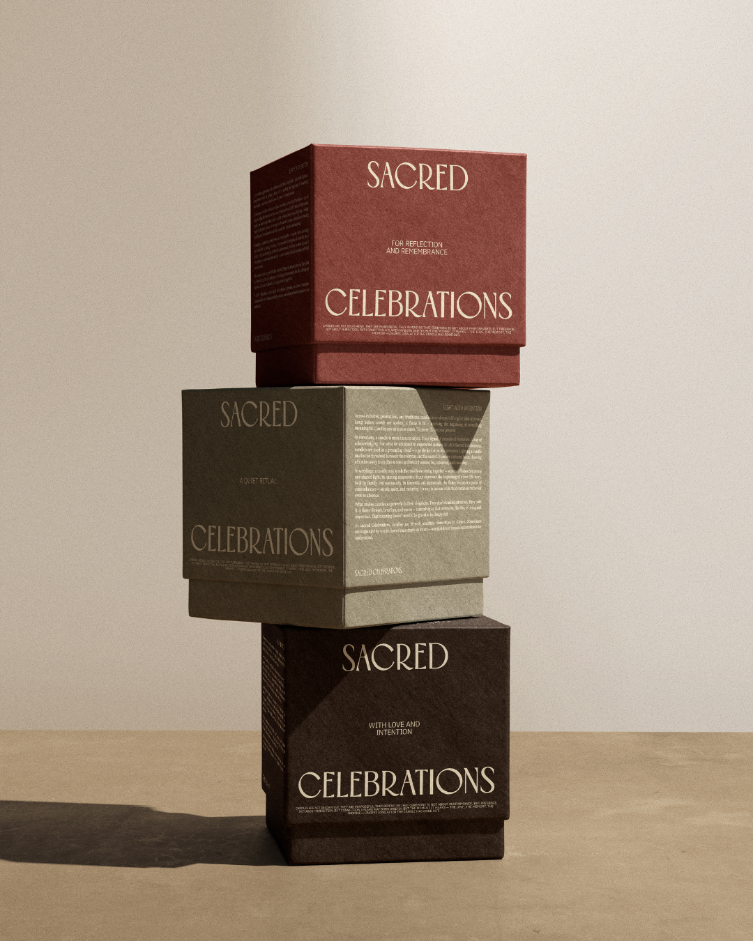
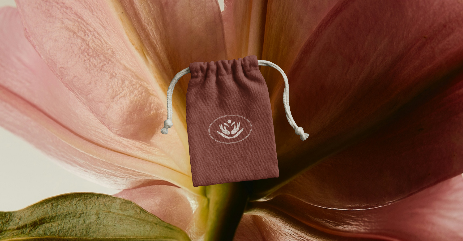
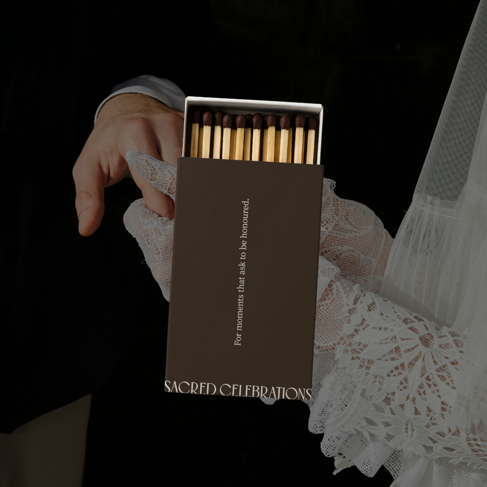
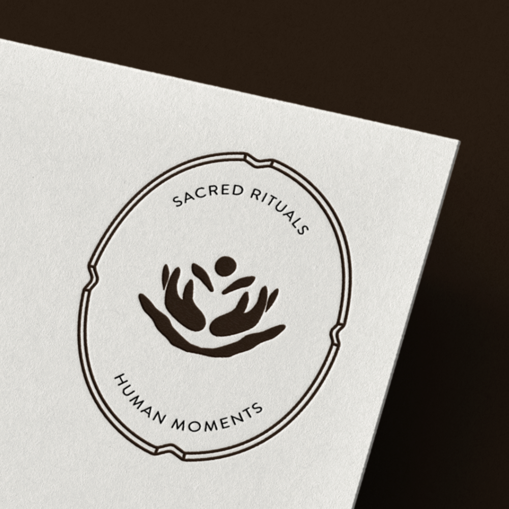
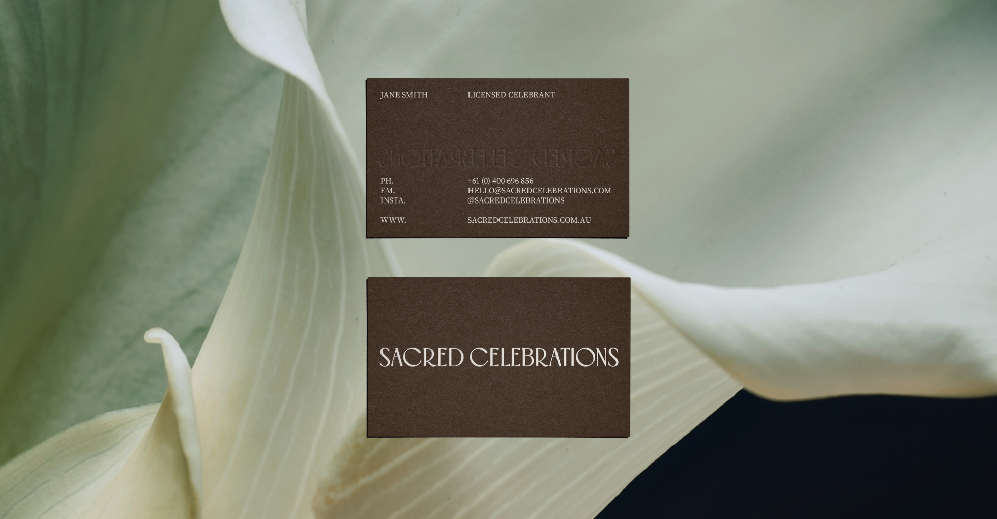
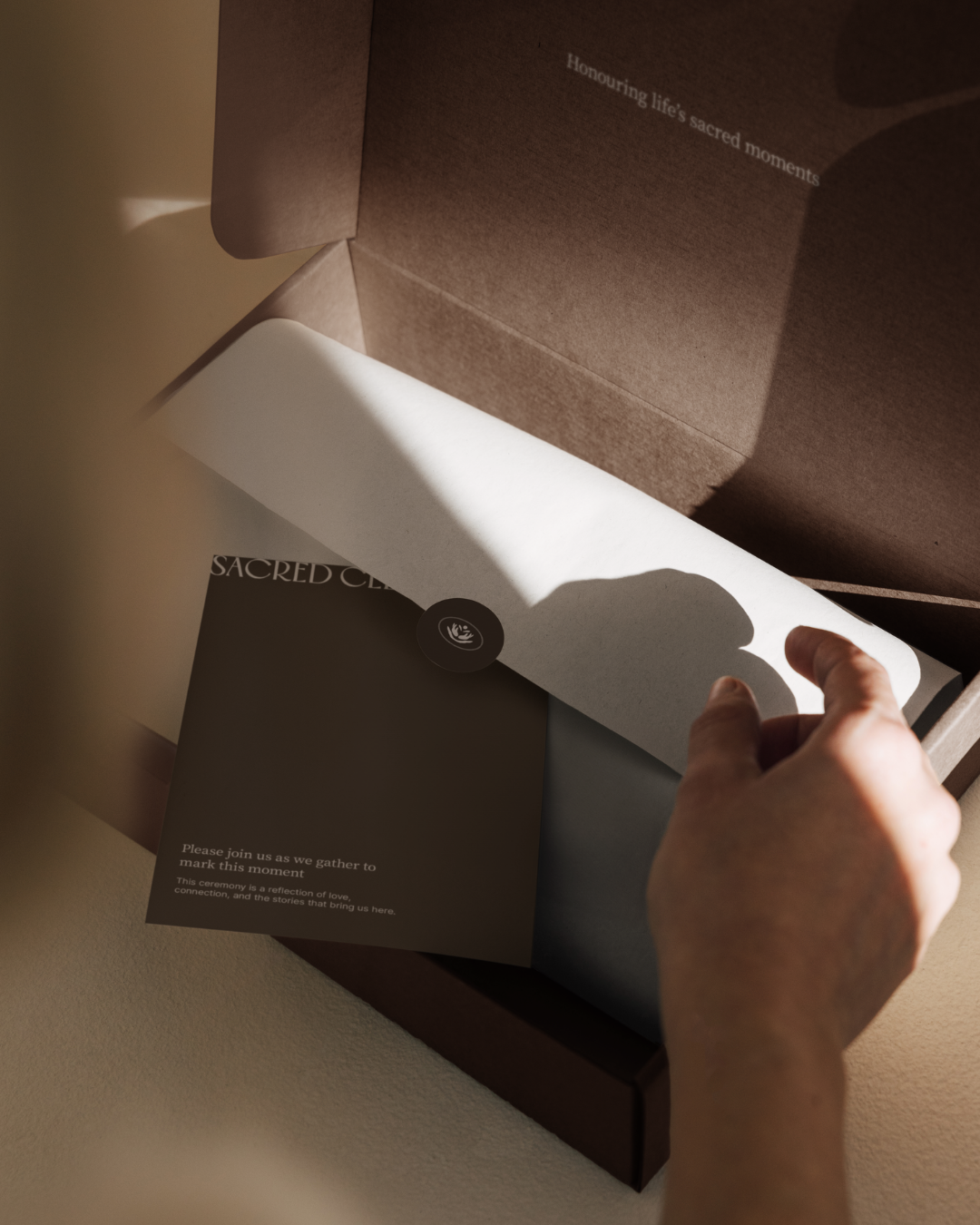
The visual identity was designed to feel warm, intentional, and contemporary. A modern, refined typeface anchors the logo, offering clarity and confidence while keeping the brand grounded and approachable. Paired with this is a custom brand mark that draws on natural forms and symbolism. The mark represents hands holding, two people coming together, and the idea of connection within nature, reflecting the role of ceremony in marking life’s most meaningful moments.
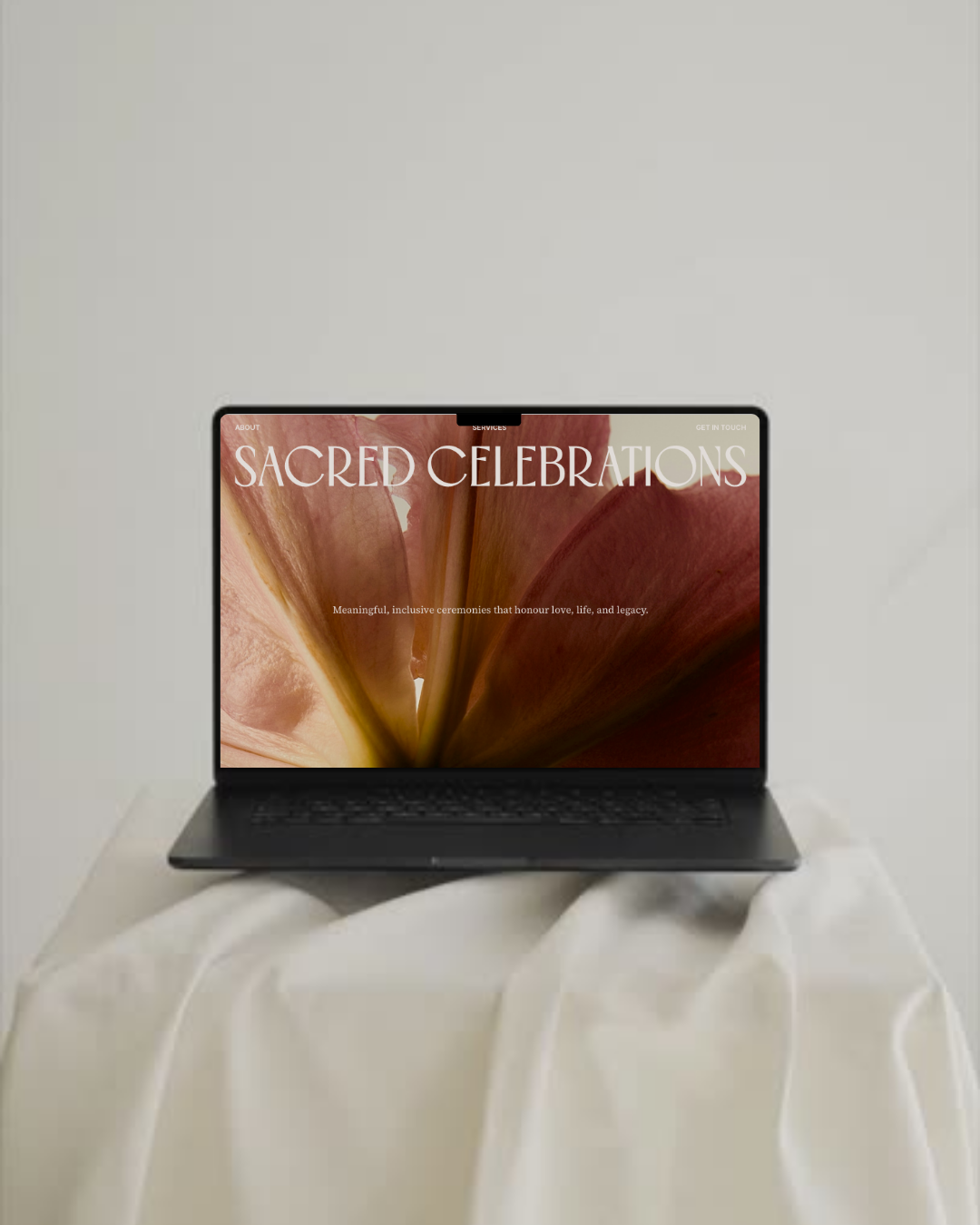
Rather than relying on familiar celebrancy or wedding tropes, the brand leans into restraint and symbolism, allowing emotion to lead. Across the website, packaging, and marketing materials, the identity feels cohesive, calm, and deeply considered.
The result is a brand that holds space rather than fills it. Modern, warm, and quietly powerful, Sacred Celebrations reflects the sacredness of connection and the beauty found in moments that truly matter.