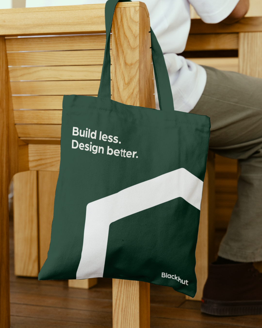
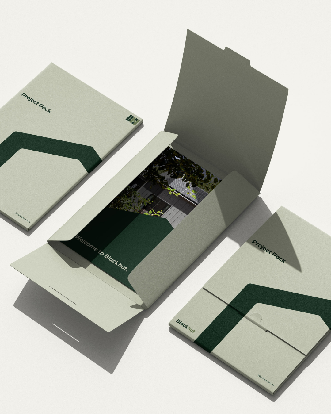
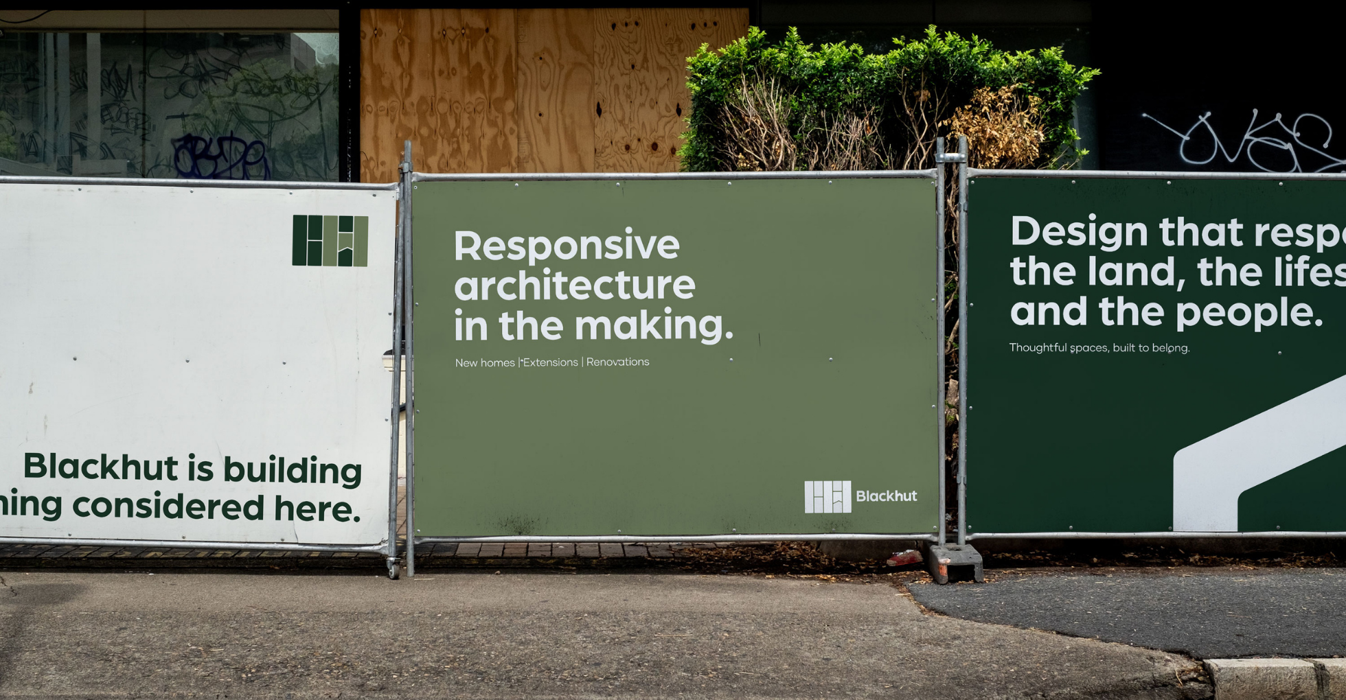
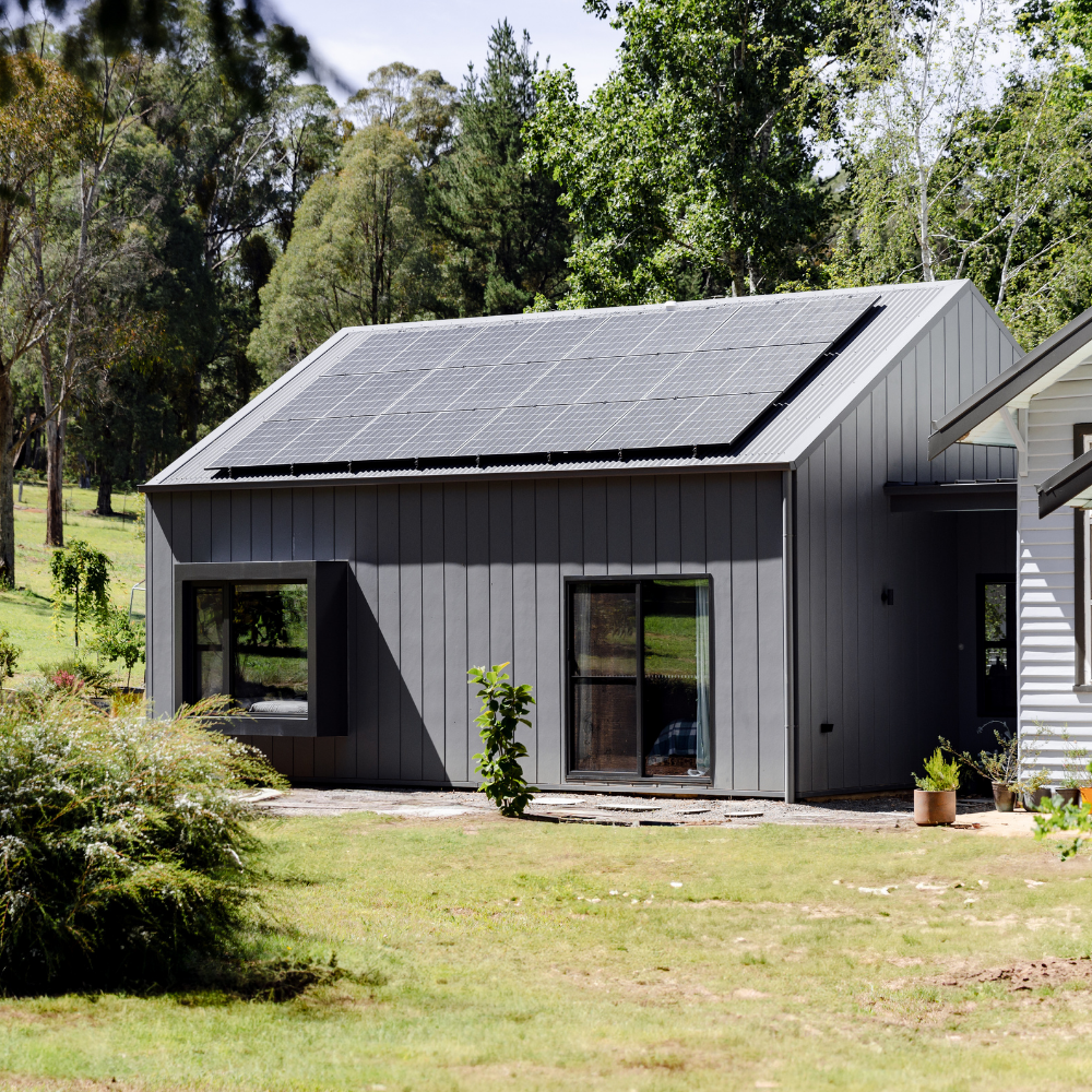
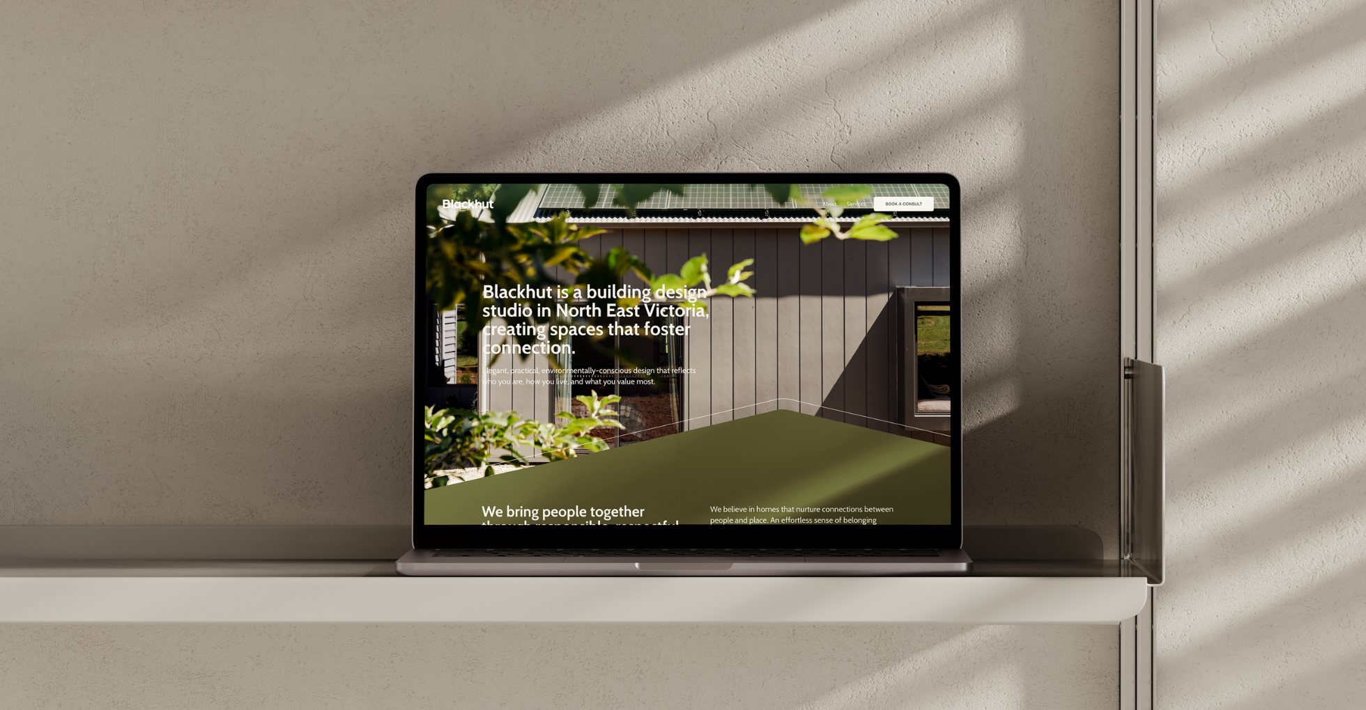
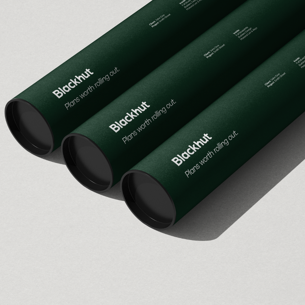
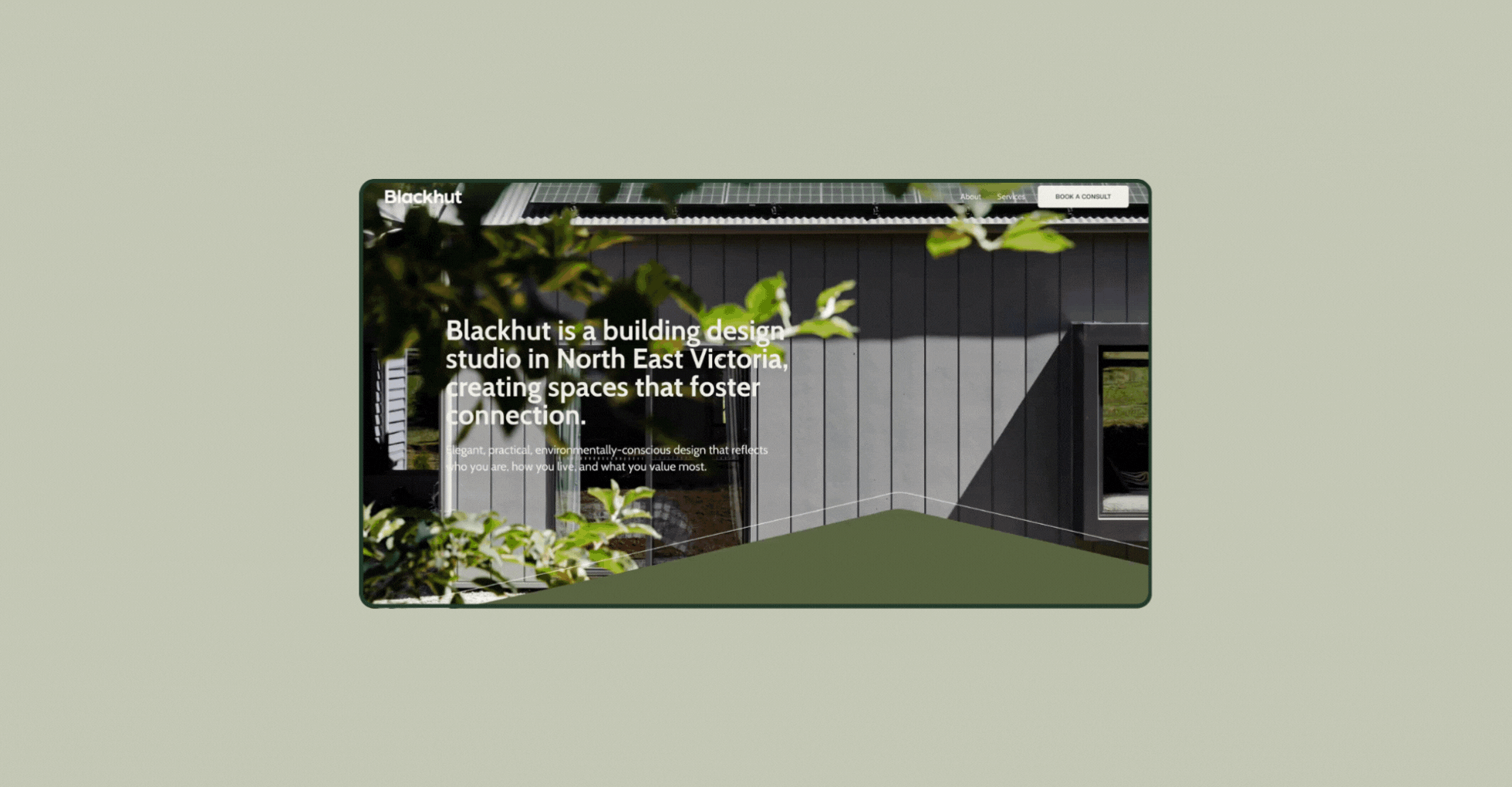
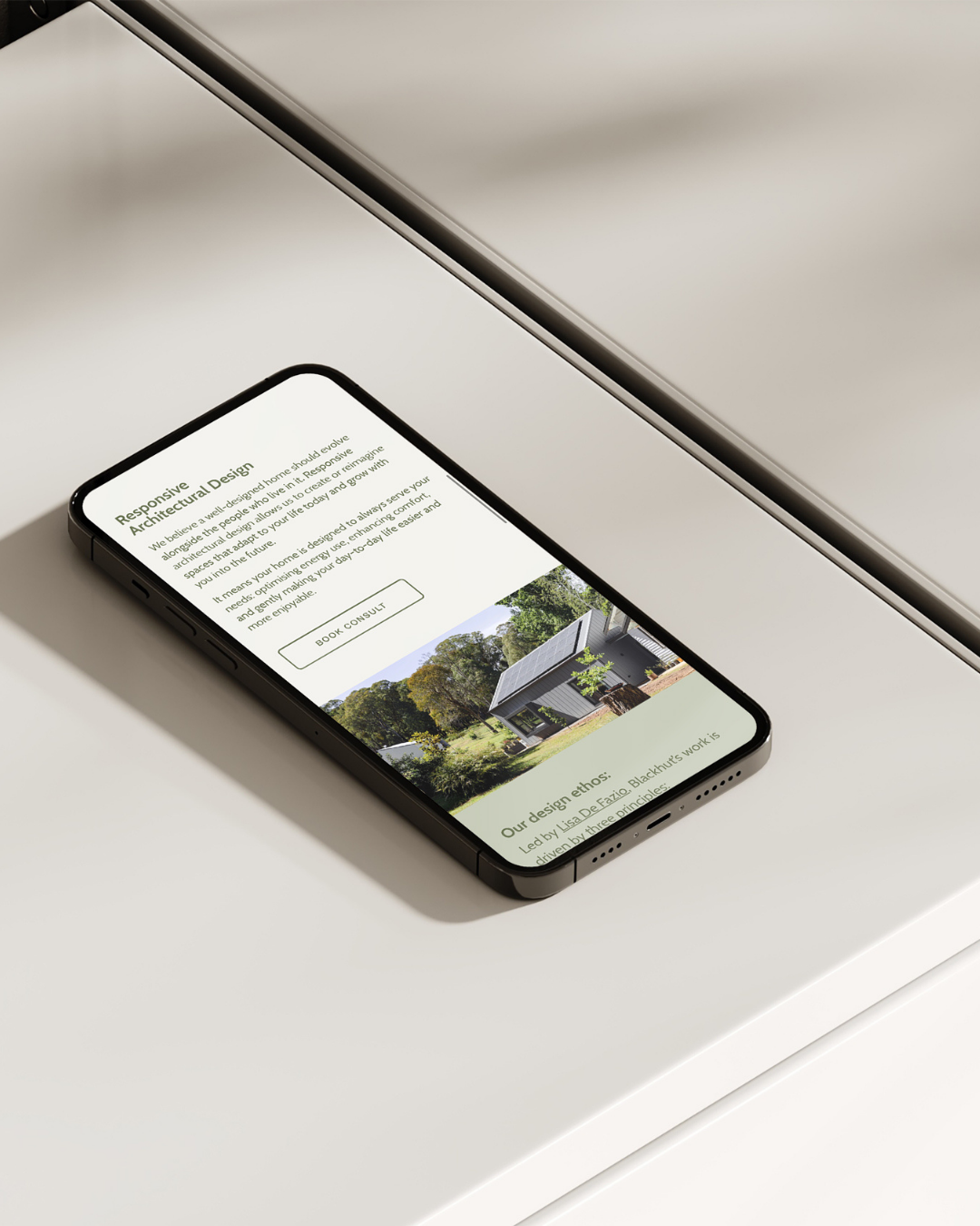
Blackhut is more than a name—it’s a place, a story, and a philosophy. When Lisa came to us, she was ready to step into a new chapter of her building design studio. It was time for the brand to reflect the depth, purpose, and elegance of the work she was already doing. So we built it just like one of her homes: grounded in place, thoughtful in form, and made to evolve.
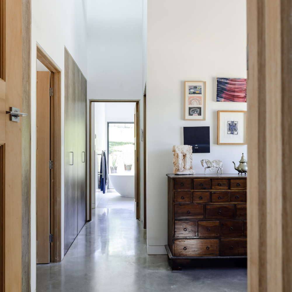
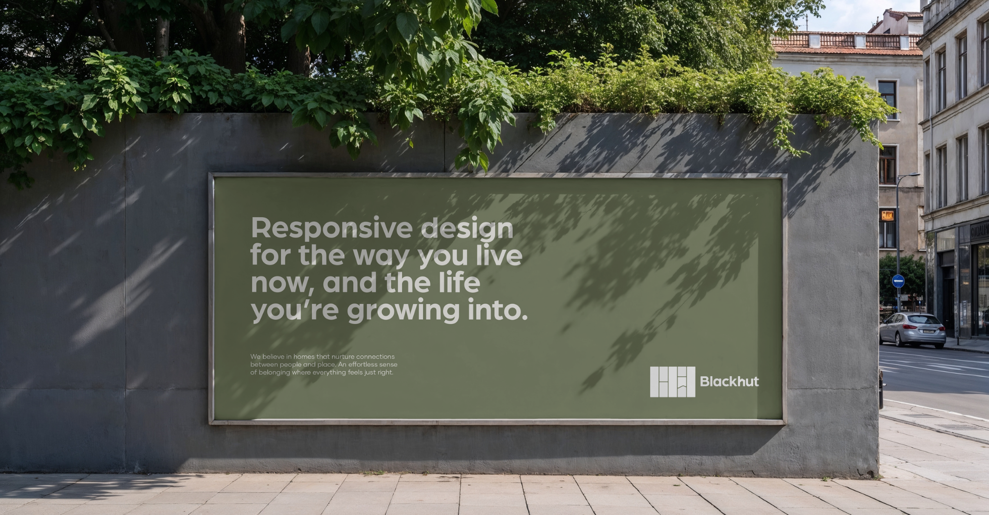
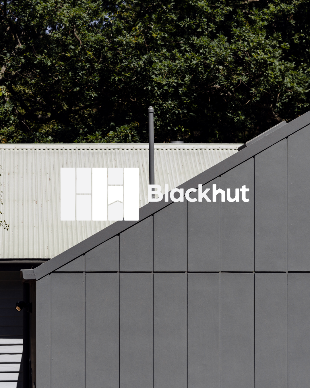
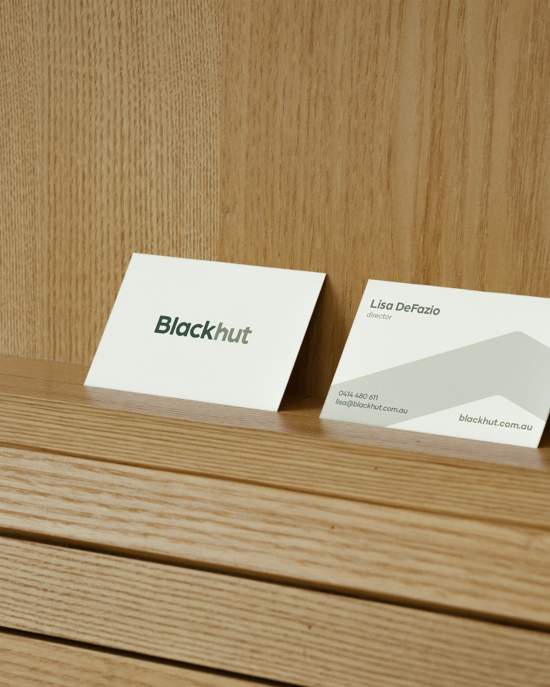
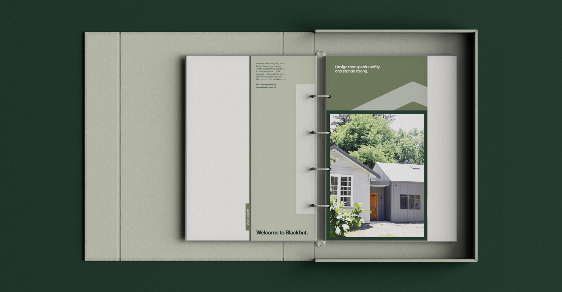
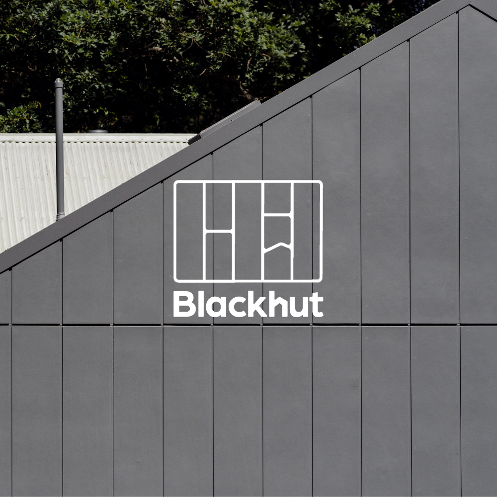
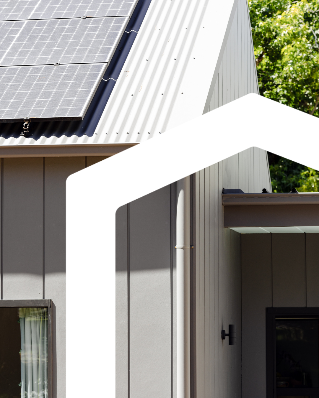
Inspired by Lisa’s own home and the silhouette of the “black hut” at its heart, we created a brand identity that draws on architectural forms, pitched rooflines, and block structures. The custom B + H symbol is abstract but intentional—a visual echo of her design style: sustainable, refined, and full of quiet strength. A pared-back natural palette and tactile elements reflect the materiality of her work, while the tone of voice speaks with the same honesty and care she brings to every project. Blackhut now stands as a clear expression of who Lisa is and what she brings to her work—genuine, grounded, and quietly confident. It’s a brand that carves out space for meaningful connection, both with clients and within the homes she designs. Built to last, designed to evolve – just like the spaces she creates.